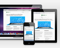
The responsive web design comes as a solution to better display content across tablets, mobiles phones and laptops of the most varied screen sizes and resolutions. In order to achieve a responsive layout, all we need is: a Flexible grid, Flexible Content (Images and Media) and CSS Media Queries. The use of these three main… →
Responsive Web Design Using Compass – Part 2
Getting into the Responsive Grid On the first part of this post, I have explained a bit about Compass and how to get it running. Now let’s use Compass to build our Responsive Grid. To better understand what I will be explaining, I recommend you download the sample code and follow it as you read… →
Responsive Web Design Using Compass – Part 1
I started my career doing Art Direction for print advertising; I learnt how to direct my creative process in many ways and an important factor to be taken into consideration was the media type and size – Magazine, Tabloid, Billboard, all the media sizes were fixed and I knew exactly the canvas size. After migrating… →


